Okay, I’m just going to start by saying that this is a totally different post than I’ve ever written before because I normally have vision for the rooms in my house but on this one I’m stuck. I’ve been staring at my living room for months, feeling like something is missing, it’s too bland, or something just isn’t quite right, but I can’t figure out what it is. Before I go on, let me give you a tour.
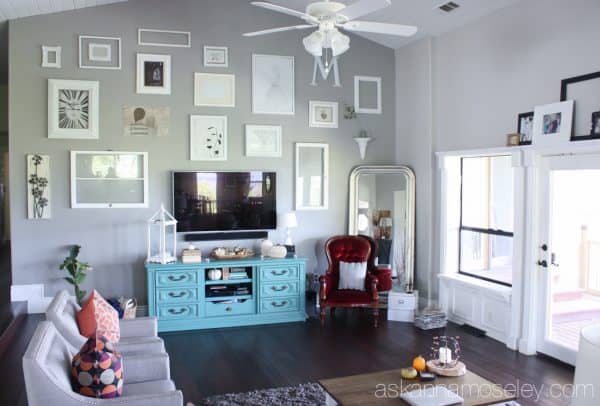
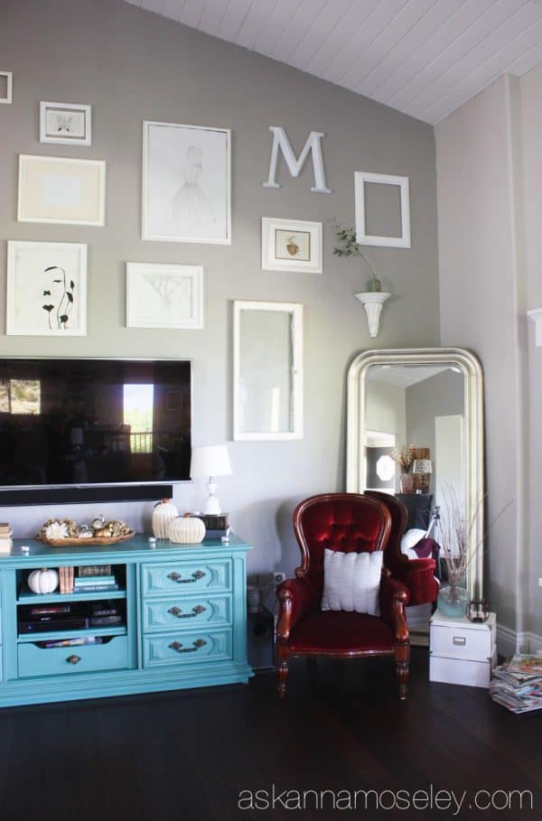
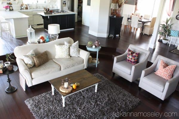

Here’s the dilemma… we’ve had the same couch for 5 years and I like it but I don’t love it in this space. It fit the space in our other home perfectly but it’s always kind of bothered me in this living room. I also feel like when I look at my living room I’m not struck with how stunning it is, like I am when I look at pictures like these, I’m more stuck on “hmmm, it looks good but something is missing…”
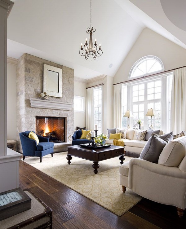
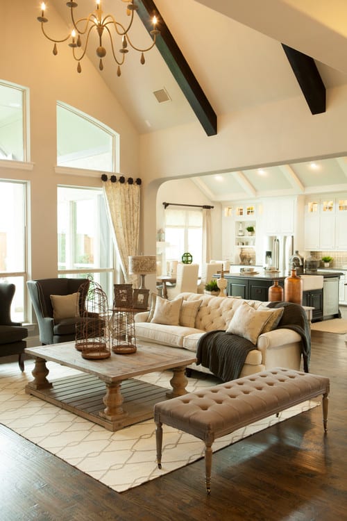
I know, I know, everyone’s space is different, and I’m not comparing, I’m just looking for that “WOW” factor, like these rooms have.
Here are the things I’m not willing to part with. I’m willing to make changes to them, but not do away with them completely.
- The collage wall. I’m willing to change out what’s up there but I like the drama of the huge collage (it’s over 20′).
- The TV console. I made over that piece for this particular space and I sort of love it. I’m willing to change what’s on top of it but not willing to do away with it completely.
That’s it. That’s all I’d like to keep in this space, the rest I would LOVE your opinion on! One last thing to give you an idea of what the rest of the upstairs looks like, here are a few pictures of the surrounding rooms that are all open to each other.
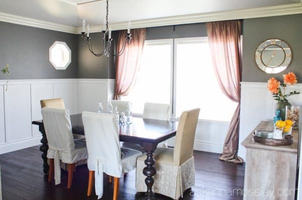
The Dining Room
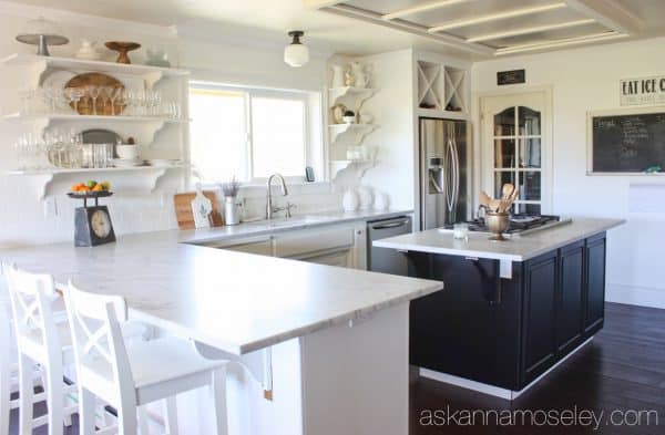
Our Kitchen (which is almost done, but not quite)
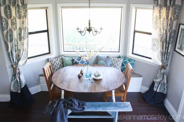
The Eat-in Breakfast Nook
And here’s one last look at the living room.
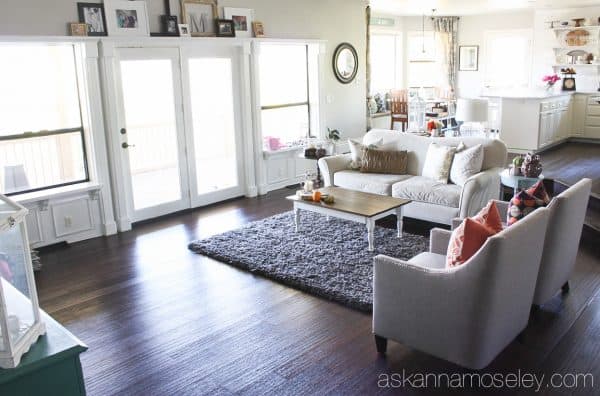
What do you think would give this space a “WOW” factor? If this were your home how would you design/decorate it? Please help me, I’m itching to change up this space! 🙂 Thanks in advance for all your great ideas!!
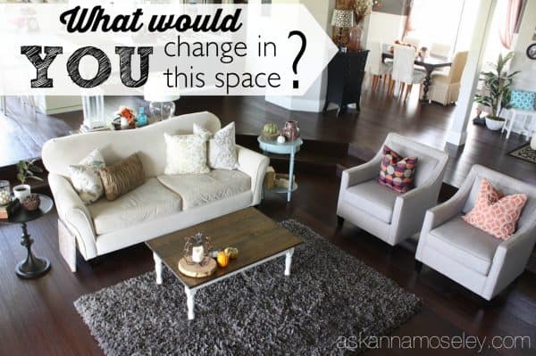
I’m probably late to this game but here are my thoughts. A bigger rug in a different color, maybe lighter, maybe an Oriental would be the one thing that would make a difference. Make it big enough so your furniture can have the front legs on it. Look at the photo of the big room with the light colored rug and how much gravitas it gives that room. Try bringing that cool red leather chair forward to be part of the seating arrangement instead of hiding in the corner. Put a bigger arrangement on your coffee table – maybe something taller would give it a little oomph.
Thank you Susan! It’s never too late to throw in your advice. 🙂 I think a bigger, lighter rug is a must, now to start looking for the right one, that won’t break the bank. 🙂
I agree completely with the larger, lighter, brighter rug. And I would play with the placement of your existing chairs. If you are looking for a different sofa, I would suggest looking into a sectional – maybe a modular one, so you could change it as needed.
I love the idea of a modular sofa. I bought a new rug today but I’ll have to save up for a couch. 🙂 Thank you for your great ideas!
Hi Anna! Your room is beautiful, but what is keeping your eye from the “wow factor” is the need to disperse the same color that you have in the console and the chair next to it. The eye draws directly to that immeditately, so if you add some of those colors, or like colors, up on the gallary wall, then in throw pillows and a draped blanket throw on the couch and chairs, you will find that you are a lot more satisfied. The picture you displayed of the other living room is a good example of this. Not too much, just enough to draw the eye around the room. Can’t wait to see what you end up with, it will be gorgeous for sure!! 😉
Thank you Michele! Yes, I think more color in the gallery wall is a must. Thank you for the great tips. 🙂
Hi, Anna, your home is beautiful! I love you reveals. Have you considered experimenting with the scale? I recently finished off my master bedroom and realized the scale was too small for the room. If you did a larger couch, coffee table and area rug it would probably feel more balanced. Just a thought.
Thank you. Yes, scale was something I really had to think about when we moved into this house because our last house was so small and all our furniture was small. I think that’s one of the things that bugs me about the couch in this space. I think I’ll add a larger rug and coffee table, as others have also suggested, and see if that makes it feel more to scale for the space. Thank you! 🙂
I would go for a bigger rug to better anchor the room. I think that also adds to coziness.
Yes, I think I agree, now I need to do some shopping. 🙂
Agree with MIchelle, needs some more turquoise or other coordinating color, i think some light color blue/turquoise sheers on the windows swept to the side how you have your dining rooms windows would do the trick?
Thank you! 🙂
Bigger rug will bring it all together and cozy up the space
Hello Anna,
Your room is pretty and almost there. If I were doing it, though, I think that a larger rug would accomplish what you are aiming for. You need to “pull it all together”, so to speak. Lay down a rug that all of your seating group can sit upon. Perhaps a larger cocktail table, as well. Get a carpet that complements the color of your sofa and chairs and keep it light and neutral. You could also use your current coffee table as a side or end table. Large pieces will give the grouping more substance and the rug will make it seem less disjointed. BTW, the rug can be a simple piece of broadloom carpet that is cut to size and bound all around. Make sure that everything in the grouping sits on the rug.
I hope these ideas help you to put it together.
Mark S
Great ideas, thank you!
Your gallery wall is awesome, but it’s a lot of white with a big black hole of the tv in it. I would mix in some other colors, black and turquoise to start, either in the frames (spray paint?) The matting, or the art itself. Definitely agree you need to spread the turquoise around the room and bit more. Also, I noticed that in each of your “wow” rooms there was a much more substantial coffee table. You could probably build something bigger without too much trouble, maybe mimicking the legs of the dining room table. That may also help the appearance that the seating area is floating in the middle of the room, pretty far away from the tv. I would also try moving the seating area slightly closer to the console, though that would change the traffic flow.
Thank you, those are great ideas! I would never have thought to move the furniture closer but you aren’t the first to say that so I think I need to do some rearranging.
I’m sorry, Anna. I forgot to mention that you might consider using fewer accessories. Use just a few, larger, pieces on the tables. Or, on a small table, try leaving it empty. I think the eye has a hard time roaming around looking at all those small items. It almost seems as though you kept adding things to try to fill up the space. Sometimes, negative, or empty space can have a larger impact. Good luck.
That’s a great tip, I would never have thought of that, thank you. 🙂
Move the furniture closer to the TV. Seems too small in scale for the large room.
I would add some color to the gallery wall. Too neutral to me. A few pops of color would do.
I was thinking the same thing, I think I will definitely be switching out some of the images.
Hi Anna, Your room is wonderful so far. A few tweaks and i think you’ll finally get that completed wow factor you’re looking for.
First thing that jumps out is the rug that’s too small. I’d go with something much larger and lighter. You need one large enough that at least every chair has the front legs on the rug (like in your inspirational photos). I’d also go with a lighter rug as the floors are dark and you want something that can make it feel less like a black hole against all your light furniture. You could do something with a nice subtle pattern like your photos or even pops of color in it to tie in the blue.
I would also increase the size of your coffee table. Something like the one in the second inspiration photo. It would mimic the square set up of the space and the weathered wood of your buffet in the dining room to tie those spaces together.. Also it would add a place for individuals sitting in the chairs to place their drinks.
I also agree with the comments below that you should disperse the color around the room. Adding a few pieces of art in the gallery wall with turquoise in them will really make them pop and bring the eye around the room more. Maybe in a few pillows or throw blankets too. The addition of curtains to the windows, swept like your breakfast nook will also help balance the room too. It can add a nice subtle continuation of color.
Thank you, those are all great ideas, exactly the advice I was looking for. 🙂
I would add a large colorful rug to the space, and you need something across from the chairs to the left of the sofa — either another set of chairs or I think a large sectional L shaped sofa would be cozy if you are looking to replace your existing sofa. Then just add some color with accent pieces and throw pillows.
Thank you for your ideas! I think I might look for a nice bench to put over there because the problem with putting chairs there is that we use the door a lot and with chairs there we can’t open it all the way. :/ I bet I can find a nice bench that would add extra seating though. 🙂
Everyone has great suggestions. I thought that perhaps you could move everything
toward the TV Line up the sofa with the door rather than the window, away from the stairs Add the color. larger rugs, tables etc. Love what you did over the windows.
Thank you. Yes, I think I’m going to have to be doing some rearranging. The thing that worries me is what to do with all the dead space behind the couch, once I move it forward. Any ideas?
A sofa table with a lamp on it helps make the couch a more intimate space for reading and a bowl or vase.
Hi Anna- I’m late responding also. What I sense from your pictures is a lack of warmth. Your window treatments seem sparse and not really working with anything else in the room to create a vibe. Definitely need something different on your floors, and perhaps something “live”- one or two plants, different textures/heights. I’m not seeing a focal piece that everything else stems from. Hope this makes sense??
Thank you for your great tips. I have one tree in the room but it’s slowly dying so I need to get a new, larger, healthy one because I agree that “live” things really add to a space. 🙂
Well, in looking at all your rooms, you seem to have a comfortable traditional taste with a bit of farmhouse chic. The only red thing anywhere was that heavily carved, ornate dark red chair. It strikes me as something you didn’t choose, but maybe inherited and keep for sentimental reasons. Also, the chairs are somewhat tailored, with crisp lines (live them) and the couch is very…swoopy. The color works, but I don’t love the shape. I too, love the wall art and the cabinet. I think the rug might be a tad too small though. It doesn’t quite reach the furniture that it is supposed to be tying together. All in all, I love your style. I think a couple of tiny tweaks would make this a space you love. 🙂
Thank you! I did some rearranging today and got rid of the red chair. You’re right about the chair, it’s not really my style, but it was free and my daughter wanted it for a reading chair. I’ve always sort of made it work but I think it is time for it to go.
H! I think one thing that you may want to change is the rug. It’s too small. The legs of the sofa and two chairs should be on the rug. If you look at the rug in the other pictures you posted here, you’ll see that the furniture legs are on the rug. But, the size rug you have won’t accommodate doing that. I think you’re right about the sofa too. Maybe it’s time for a change. Good luck Anna! I know you’ll figure this out. You always do 🙂
Thank you! I ordered a new rug today after reading everyone’s comments. 🙂 I can’t wait to post pictures after taking all of my readers great tips!
Well I can’t wait to see it!! You’ll get it the way you want!! Sometimes it’s like a puzzle and then “viola” it all falls into place! 🙂
Wait!! That should have said Voila….Not viola!! Hahahaha
Haha, I would’ve assumed that’s what you meant. 😉
(Please excuse me if this is duplicate advice.)
I love your room, but I think the general rule for area rugs is that two legs of each piece of furniture must sit on it at the minimum.
I would minimize the decor on the end tables flanking the couch, to make more visual room. And more elbow room for guests’ coffee cups.
I’d move the chair into the conversation circle instead of being lonely in the corner. The color is richer/more intense in tone, so if possible I’d either paint and recover the chair, or bring in a similar shade elsewhere in the room.
I’d put matching pillows on the two side chairs and put brighter pillows in the couch because they disappear against it. But I like color. 😉
With a bigger carpet (even the same color and style) I’d love your room just as it is though!
Thank you for all your great tips! I have already done some rearranging and bought a new, bigger and lighter rug online. I can’t wait to repost after implementing all of everyone’s fabulous tips! Thank you!! 🙂
The three things I noticed right away are that you need a bigger rug and sofa, and some type of window treatment on the windows. Maybe some bamboo blinds? Even if you don’t want to buy a new sofa, a much larger rug would make a big difference. I love your dark hardwood floors! It’s such a large room and maybe you are feeling it’s lacking something because the scale of some of your furnishings is small. Whatever you end up doing I’m sure it’ll look beautiful!
Thank you. 🙂
Move the red chair forward…into the conversation pit.
I like the suggestions others have made, including a little color on the gallery wall.
My thought is that the gallery wall is too perfect, too spaced. I wonder what it would look like with more groupings instead of so evenly spaced.
Haha, that’s my problem with gallery walls is that my OCD-ness doesn’t allow me to think outside the perfectly squared off box. 😉 I did move some things around though and add some color so you’ll have to let me know what you think when I post my “after” pictures. Thank you! 🙂
I love following your blog. You always have creative ways to solve household dilemmas and beautiful tips on decorating. I think the coffee table needs to be replaced with something larger and possibly more square than rectangle. Also, if it doesn’t break the bank I would consider some kind of Chandelier.
Thank you Myra! I would LOVE to have a chandelier in the living room but unfortunately it’s way too hot here to not have a fan. 🙁 I have them in all the surrounding rooms but I think a huge chandelier in the LR would be amazing! And yes, I think I’m going to be replacing our coffee table, a lot of people mentioned it should be larger/square and since I rearranged the furniture, per yesterday’s comments, I’m seeing the need for a more square table too. Thank you! 🙂
I think it needs a statement floor rug – not necessarily one full of in-your-face colours or pattern, but something to ground the room. The one you have is nice but is a bit small and quiet for the space. It’s a beautiful room. Just my two cents worth 🙂
I would replace the rug with one a bit bigger. I would change the coffee table also to maybe something eye catching, possible even a lucite one just to catch the eye and the pillows on the sofa need a touch more color/pattern. It has great bones but just needs a little facelift.
Thank you Karen! 🙂
Paint, paint, paint. Those walls could use some color. Especially the living room.
Hello Anna,
Like everyone else, I hope I’m not too late but I would create two sitting zones by moving the white couch closer to the tv and placing the red chair in front of the window with a end table next to it. I would place the matching chairs closer to the steps where it starts to curve with a table between them for a reading area. Or just add a 8X10 rug that has warm colors similar to whats in the room and some pillows that match the red and blue in the room. Or, do like I do and move the furniture around until you like it. Sometime taking pictures of the room helps me. Love your style.