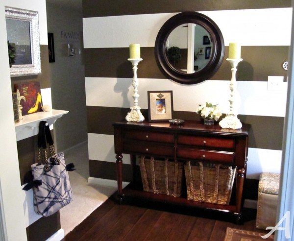
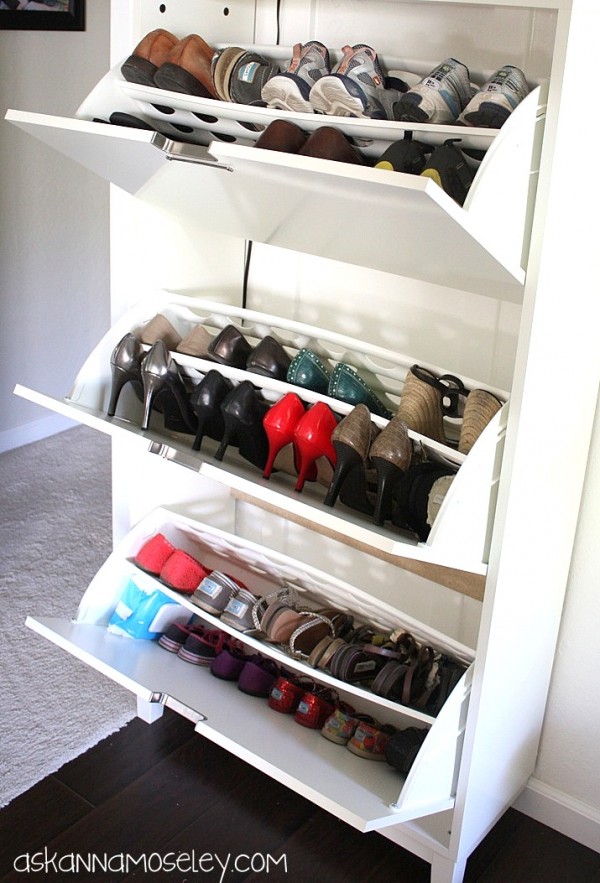
I am SO excited to show you my entryway makeover! I was sad to see the stripes go, but it needed to happen. The stripes were just too dark for our tiny entryway and they made the room feel even smaller than it really is. Also the shoe situation was making me crazy!!! You can see how I solved that here. So are you ready for the reveal??? First here is a before picture:
And here’s what it looks like now…
{Insert squeal!!!} I love it!
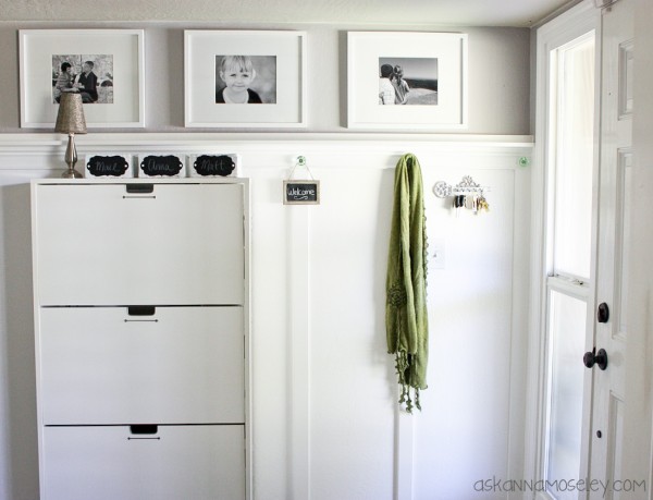
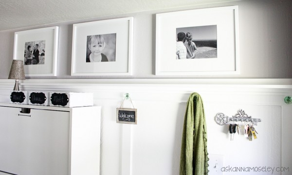
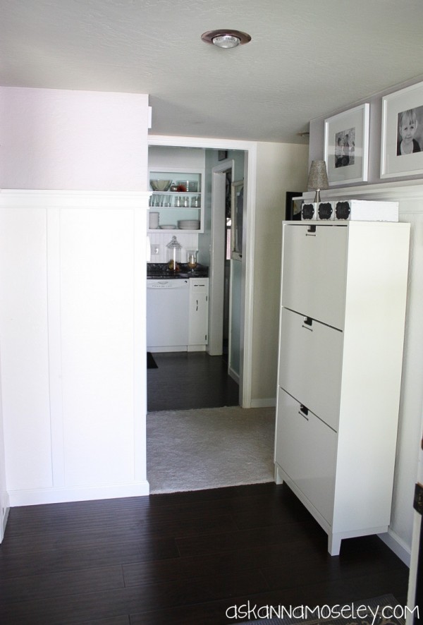
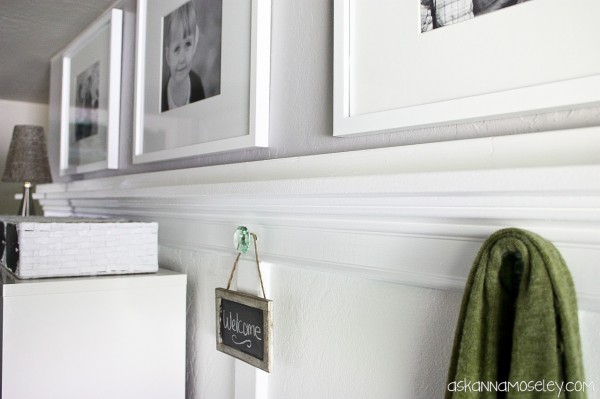
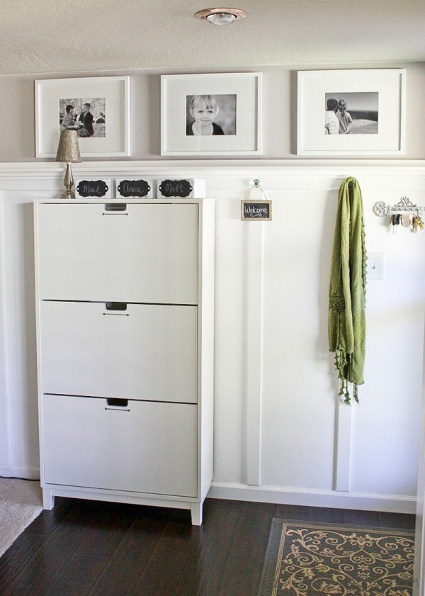
The room feels so much brighter and so much bigger but all I did was switch out the furniture, add some molding and do some painting! I think adding the photos above the board and batten makes a big difference because it gives the illusion of a taller room since it draws your eyes upward.
I love every little detail of this room. I mostly love that it’s so simple but at the same time, so beautiful.
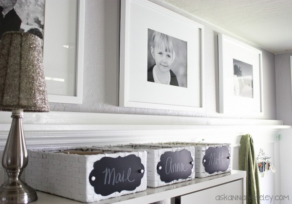
I added baskets to the top of the shoe organizer so that Matt and I would both have a place to store our crap stuff when we walk in the door. There used to always be stuff sitting on top of the entryway table and it drove me nuts! Now all that stuff is hidden in the baskets and I can forget it’s even there!
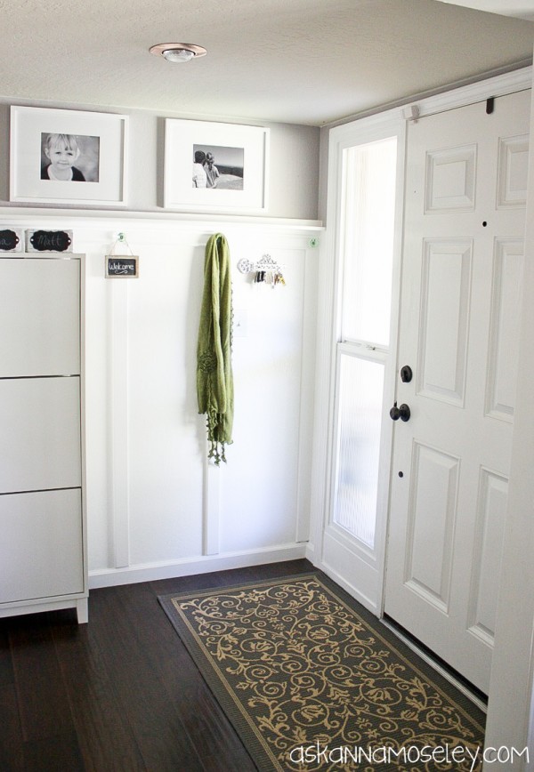
Here’s the view when you’re walking in the house. I think the gray and white walls fit the house so much better than the dark stripes did. Don’t you just feel so welcomed by how bright and pretty it is?
Matt did a fantastic job on the boards, molding, etc. {click here for the tutorial}. I was very impressed with his handy work on this project.
So what do you think? Do you love it as much as I do???
Here are a few of the details:
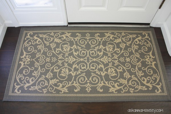
The rug is from Overstock.com.
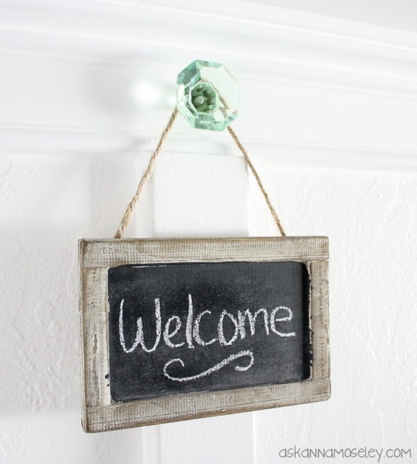
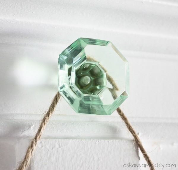
The beautiful knobs that I used as hooks are from the Liz Marie Etsy Shop.
Paint colors:
Gray– Sherwin Williams Ponder
White– off the shelf {no color added} Valspar Paint plus Primer
The shoe cabinet is from IKEA.
I love it!
I would also maybe add a small green stool in the corner there for perching on when putting on shoes and bringing a pop of colour to the corner! xx
I’ve been keeping my eye out for the perfect piece. Haven’t found one yet though… 🙂
I LOVE It!!!! Beautiful job, Matt & Anna!!!
Love the change! It’s so much brighter and happier. Great job! I’ve got to get one of those shoe cabinets.
I absolutely love what you did! I will be filing that away in my inspiration folder for sure. Just so bright and fresh and beautiful!
I love everything about this. The white looks so clean and fresh. And that shoe cabinet is fantastic!
Stunning – love your makeover.
I am LOVING this transformation my friend! Great job!
Absolutely beautiful!!! I especially love the handles!! Great job!!
I love it – I have been dying to put B&B in my front entry!! Did you paint the lower wall or did you add board on top?
We painted it, 6 coats of paint+primer! Took a lot to cover up those dark brown stripes. 🙂 I’ll be posting a tutorial this week.
I totally LOVE it Anna! It looks absolutely incredible and putting the shoe cabinet there was genius. The green knobs are gorgeous and the little chalkboard tags are super cute. Well done my friend! 🙂
Vanessa
Anna – it looks fantastic! Doesn’t even look like the same room! Great job — how do you like your shoes storage? It looks so bright and cheerful! Good job!
Becky B.
http://www.organizingmadefun.com
Organizing Made Fun
Totally LOVING the entry way!!!
It looks awesome. I am so impressed and a little jealous too. My husband and I were not blessed with the abilities to work with power tools or construct things. Any project that we have started, we always have to pay someone to come and correct our mistakes and complete the project!
You have been blessed with a great gift of being able to create and decorate with beautiful results!! Enjoy your work of labor!!
Thanks for all of your wonderful idea’s in your blog, I enjoy each of them very much. God Bless!!
Thank you Barbara! Yes, I am definitely thankful that my husband can work with power tools. I don’t think anything would ever get done if he didn’t! 🙂
I love the clean, fresh look and especially the practicality of your entryway makeover! I can’t see how long the walls are in the space so please forgive if this is a ” dumb” question. Why did you opt to put the shoe closet where it partially blocks the doorway to the rest of the house? From what little I can see, it looks as though it might fit on the wall opposite of where it now sits. Just curious.
That’s actually where I wanted to put it but the wall is about 4 inches too short and it looked funny. I also wanted to put it up against the window, on the wall it’s on now, but there’s a light switch there. :/ So basically it’s at where it’s at because it’s the only placed that worked. It wasn’t my first choice either but now that I’m used to it, I think it’s fine. 🙂
Dear Anna:
I really love the changes made. I have been thinking about a light gray with white for a couple of spots in my home. Seeing this is now a definite YES!
Quick question: what is the cost difference between board & batten vs. beadboard with moldings? I like both looks, but the $$$ may make the decision for me.
I always enjoy seeing new things in your feed! Thanks.
Gloria
Both looks are great but the beadboard and moldings will cost you more since you have to buy all the beadboard. Luckily it’s not too expensive but the way we did it is definitely cheaper. I think it just comes down to what look you are going for. 🙂
Love the baskets, White colors gives a neutral elegant look to your wall but most of designers often avoided this color due to smudged.
You did an amazing job! It looks amazing! I can’t wait for your tutorial, and to see what you put in the corner!
Thanks Mindi! The tutorial is already up, here’s the link: https://askannamoseley.com/2012/10/board-and-batten-tutorial/. I’m still looking for the perfect little stool though… I’ll post about it when I find it. 🙂
So pretty! It’s amazing how some paint and moulding can transform a space so well! I love how bright this is and all the storage! Thanks for some inspiration. I am actually in the process of creating an entryway space in our home as well!
Thank you Ellora!
I LOVE it! It is so bright…you can never go wrong with white woodwork! It looks great!!
Sally
Thank you Sally!
Hey, Anna! I love what you’ve done. One question. Are the walls white as well? They look like they are a light gray. If they are, what color did you use? I am looking for a light gray for my guest room and I really like the color of your entry walls.
The gray color on the walls is Sherwin Williams, Ponder. It looked a little purply in some lights but it’s a very pretty color. Another really pretty gray color, that I put on the walls in our new house, is Partridge Gray from Better Homes and Garden. It’s made by Glidden and the color code is BHG808.