I’m in the middle of doing a makeover on our entryway because up until now it has been boring and bland. I’m having fun decorating around the door but there was a big blank space above the door that was driving me crazy. The old owners had a metal design up there but it wasn’t my style so it came down on the first day, and has been blank ever since.
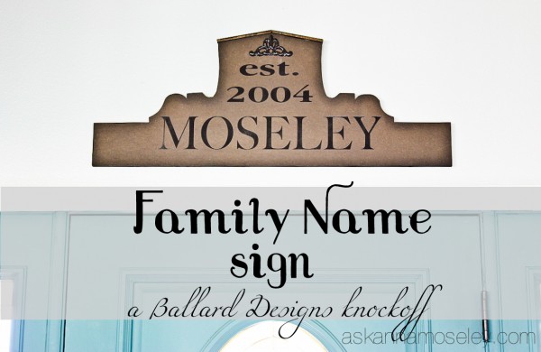
A few weeks ago I was searching through my Ballard Designs magazine and found this wooden sign and fell in love. However I’m super cheap and wasn’t about to spend that much for a sign for above my front door. Which meant it was time for a Ballard Designs knockoff!
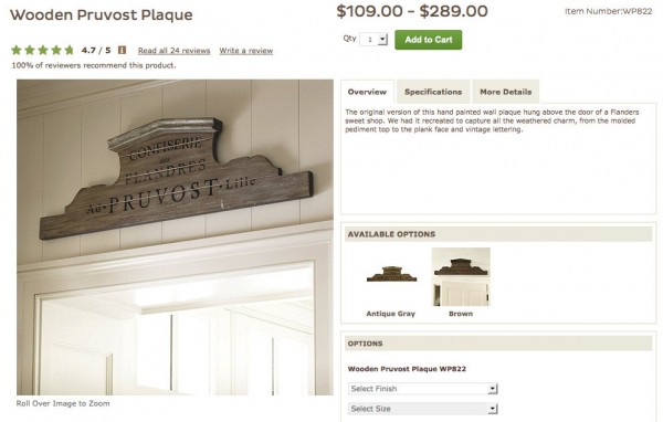
So… I commissioned my artistic teenager to sketch out a similar shape. The piece of wood I had wasn’t quite as wide as I’d hoped for but here’s what she came up with.
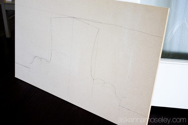
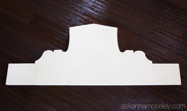
The top part seemed a little too “top hat-ish” to me so I trimmed it down a little and then had Matt cut it out for me with his Jig saw.
After he cut it out, I decided I wanted to stain it so I pulled out the three stains I had on hand and tested them out.
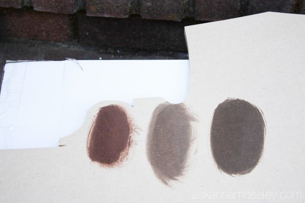
I liked the stain in the middle because it looked more like the original, but the other decorations around the door are a little darker, so I decided to go with the dark Walnut color.
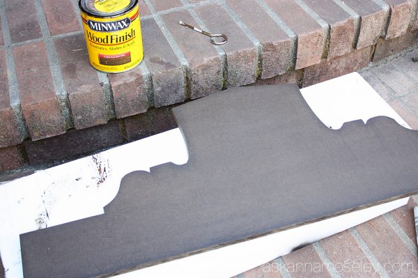
After the stain was dry, I designed what I wanted to put on the sign, using my Silhouette program. I laid the vinyl stencil out over the sign and spray painted it.
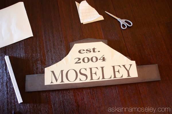
Next I needed to add some trim to the top, like in the original, but I didn’t want anything too bulky so I went with this small moulding that I found at Home Depot for about $5. It came in an 8′ piece but of course I only needed a few inches of it. Oh well, I’m sure I’ll find another project to use it on.
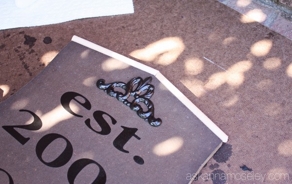
After I stained the trim I added it to the sign with a little wood glue.
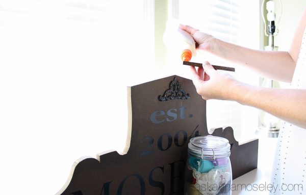
Then I added a hook to the back and hung it above our front door.
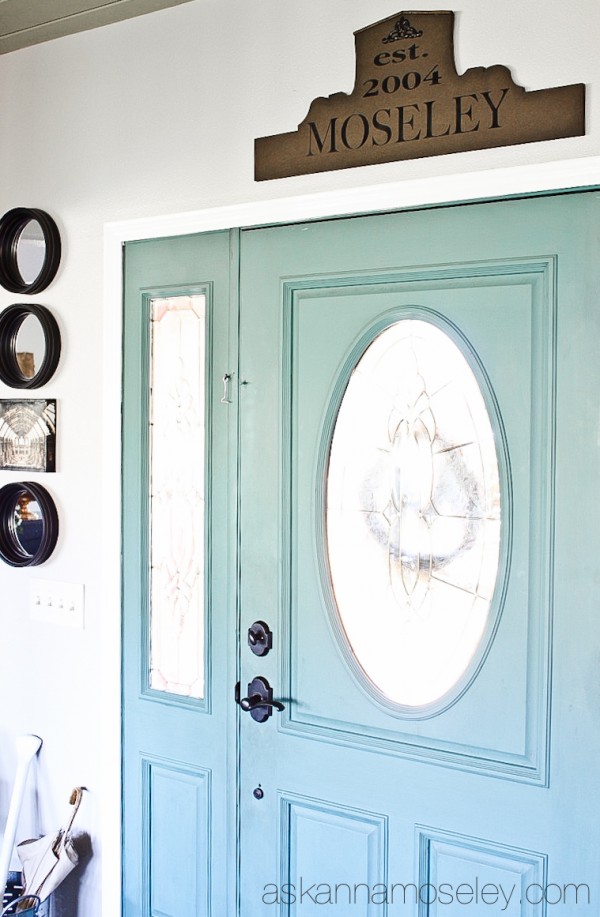
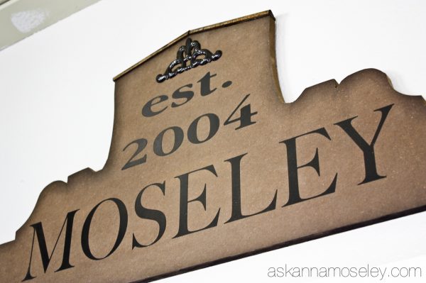
I love the way it turned out and the best part is that it only cost me the $5, for the moulding, because I had everything else laying around in the garage! That’s a whole lot better than $100+ for the original!
Disclaimer – I have included a few affiliate links to the products I used in this project, if you buy through the link I get a small commission but you don’t pay a cent more than you normally would. Thank you for supporting Ask Anna!
LOVE THIS!!!
Looks great!
It looks darker around the edges than in the center-how did you do that?
For some reason the stain absorbed around the edges more. I think it’s because they were a little rough.