I’m excited to show you my first makeover using the Better Homes and Gardens products available at Walmart. In our new house (I know we’ve lived here for a year but it still feels new) we don’t really have an entryway. When you walk through the front door you pretty much walk into the main floor of the house, which is completely open. With as often as we have people over I was thinking it would be nice to at least “fake” having an entryway, an entry that really welcomes our guests.
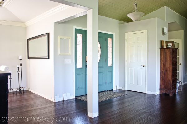
Yes, the ceiling is still green. Hopefully in the next couple months it will be getting painted because the green makes me CRAZY!
On my trip to BHG in Iowa, I was so inspired by everything I’d seen that I set out to create an entryway with all the fun BHG products at Walmart. You can see that I was pretty much working with a blank slate.
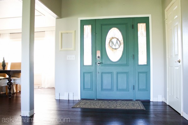
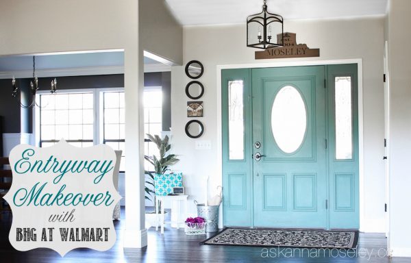
Welcome to my new entryway!
The first thing I needed was a new entryway rug. The one we had been using was brought over from the entryway in our old house, and it was totally the wrong color for this house. It’s funny how different lighting will totally change the color of something! I also wanted to get a larger rug to define, and sort of create, an entryway.
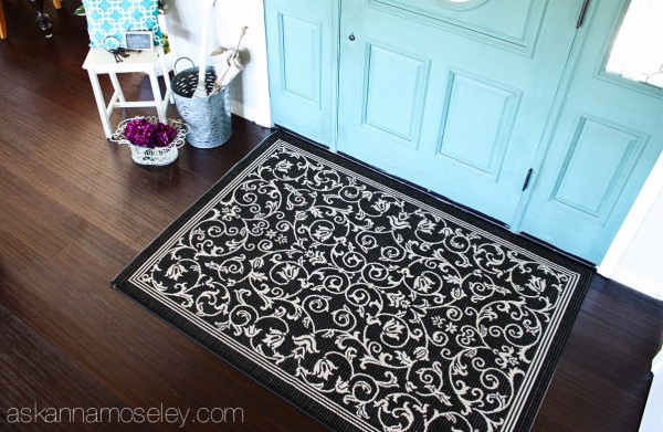
I found this large indoor/outdoor rug on the Walmart website and loved it. The funny thing is that when it was delivered and I rolled it out, I realized it was the EXACT SAME pattern as my old rug, just different colors and way bigger! Isn’t that funny? I guess I know what I like. 🙂
Every good “no shoes in the house” entryway has a place for guests to sit down and take off/put on their shoes. We have the French stenciled piano bench on the front porch, but a lot of times it’s too hot or freezing cold outside, so people don’t want to sit out their and put their shoes on.
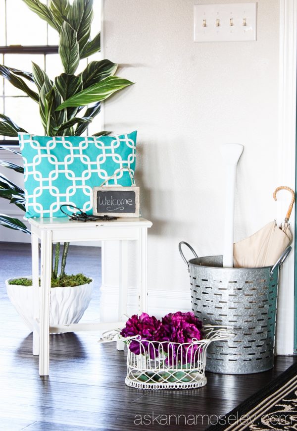
I found this super cute little stool at a local antique mall and I thought it was perfect because it didn’t overwhelm the space like a chair would.
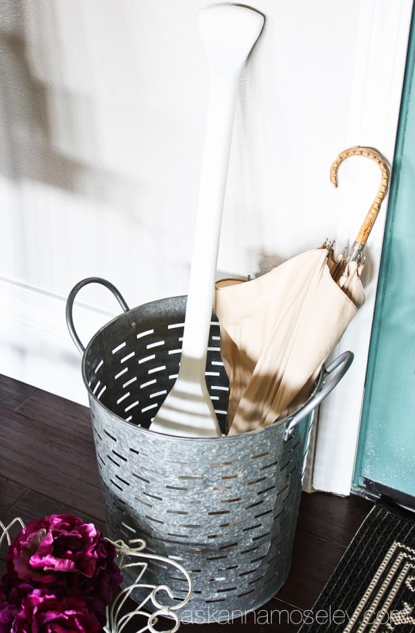
With the rainy season approaching I wanted to have a place for my guests to put their umbrellas. When I was in Iowa at the BHG tour I saw this galvanized round bin and fell in love (so of course I came home and ordered one, heck, for less than $13, who could resist?). It’s such a fun accessory and I think it looks great in the entryway. It will also be a great place for people to put their shoes, in the summertime, to keep them from getting scattered all over the entry.
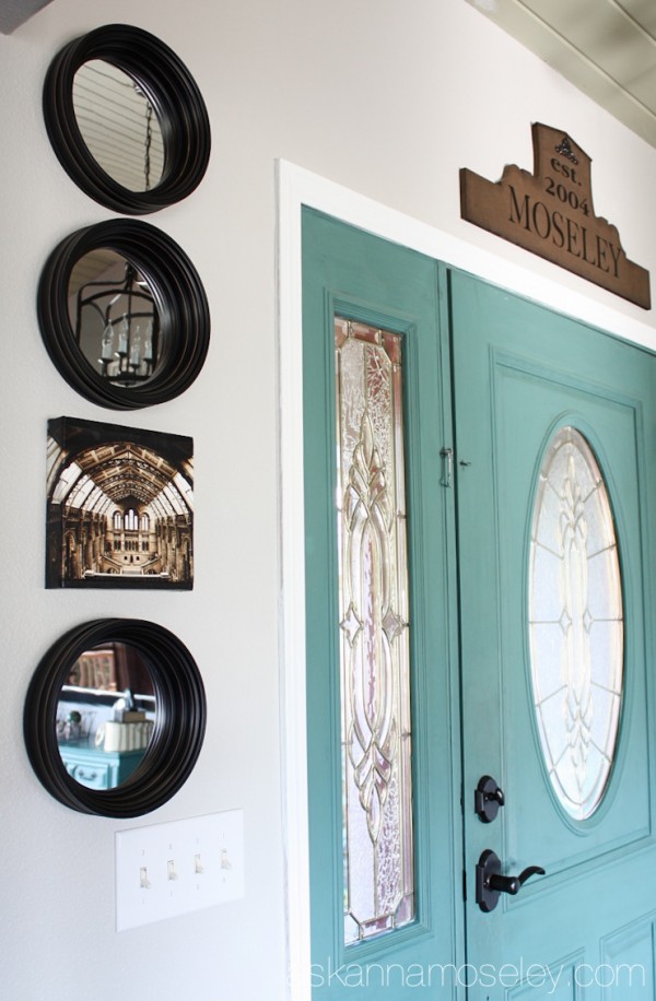
A fun decorating tip I learned from my trip to BHG is to take advantage of the height of a wall. The designer said to stack items to draw your eye upward, which makes a space feel bigger. I love mirrors so I thought adding these port hole mirrors would be a fun way to add more light and height to the space.
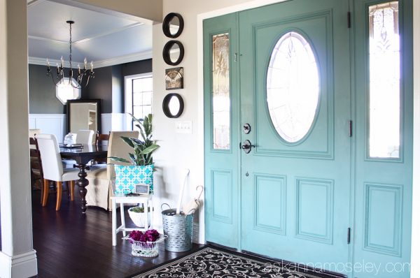
I also changed out our entryway light because the other one wasn’t really our style. I have to brag for a second and tell you that when this light came I was so excited to get it and wanted to install in right away but Matt had just left for a 4 day trip!
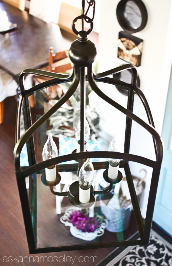
I wasn’t sure if I should take on a light installation by myself but that night my 5 year old said, “I know you can do it mommy”, so I tried and it worked! I installed the light all by myself! 🙂

I “painted” the ceiling in this picture so you could see the light and not be distracted by the green ceiling. 🙂
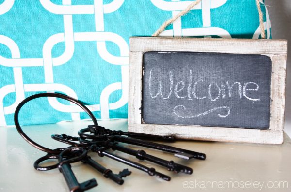
I also added a few more accessories, like this DIY sign above the door, some flowers in a basket, etc.
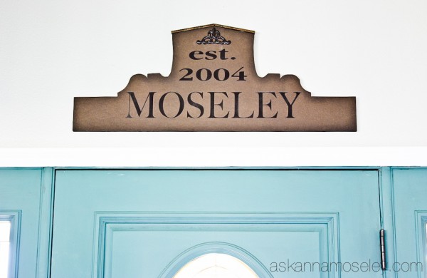
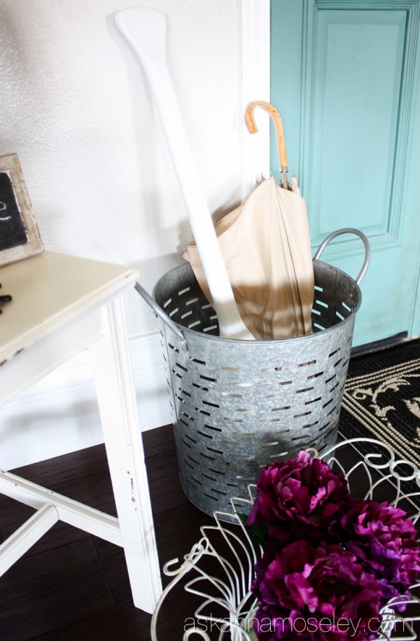
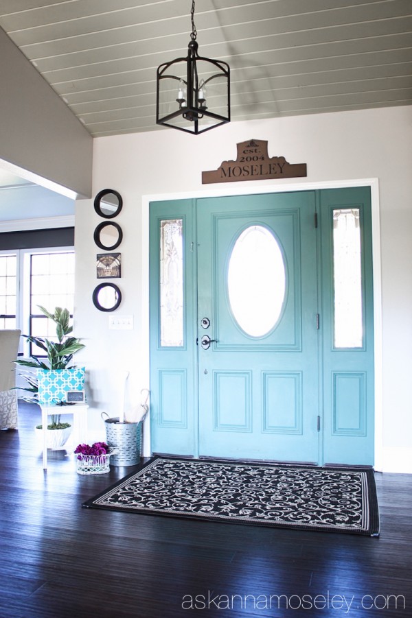
I love the way it turned out and I love that we now have an entryway! I think it’s the perfect spot to welcome our guests into our home. What do you say, want to come over and enjoy a glass of wine with me?
I always love a good before and after picture so here are a couple of our entryway.
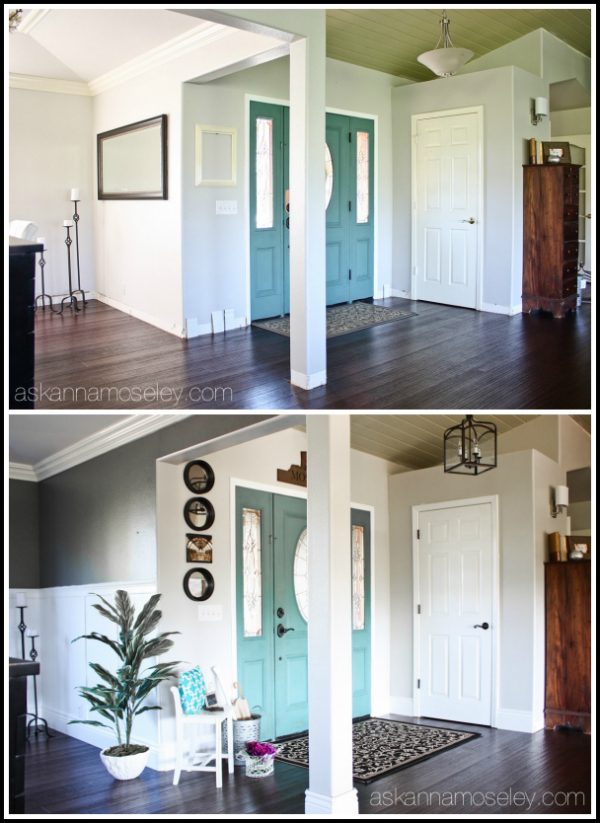
As you can see we are also working on the dining room. That reveal will be coming soon!
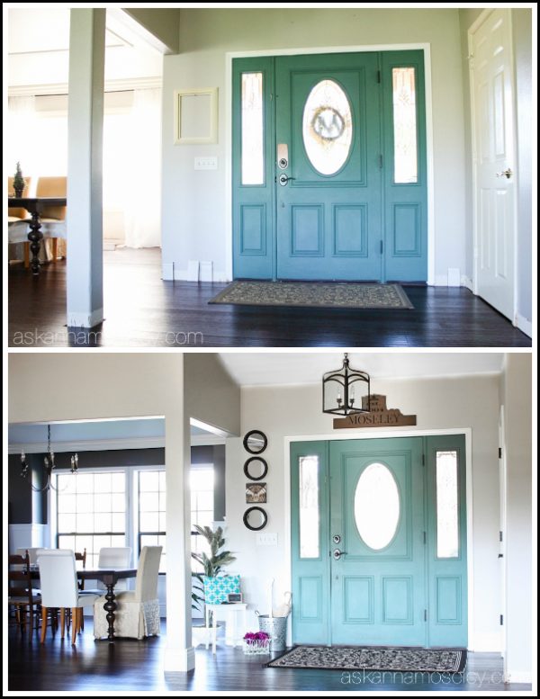
Like what you see? Here’s where to find everything –
- Entryway light
- Entryway rug
- Galvanized round bin
- Port hole Mirrors (set of 3)
- DIY sign above the door

Follow Better Homes and Gardens at Walmart to see what’s coming out soon!
Disclaimers – I am part of the BHG Live Better Blogger Network; this post is sponsored by BHG at Walmart. All opinions are my own.
I have included affiliate links to the products I used for this makeover, if you buy through the link I get a small commission but you don’t pay a cent more than you normally would. Thank you for supporting Ask Anna!
Your entryway is gorgeous and so welcoming. Kuddos to you for installing the light all on your own. Your other light fixtures are probably nervous now.
Haha, yes, they should be! I just switched out the dining room light this weekend. 🙂
what color is your entry way light gray?
When it came it was a tan/brown color, which I hated, so I spray painted it with Krylon’s Oil Rubbed Bronze color. It turned out perfectly, it looks like it came that way. 🙂
This looks so cute Anna! I love that galvanized basket, I’ve been eyeing it. And those mirrors look great!
I love it! So welcoming 🙂
Love the makeover as this is very much like my entry way. Disappointed that the link for the rug takes you to a similar but not the same at all rug. 🙁
Oh, I’ll check on that because it was going to the right one. Thanks for the heads up!
Okay Kelly, it’s fixed. Here’s the link – http://bit.ly/YqkBS4
It looks great! Those galvanized buckets are one of my favs!
It’s gorgeous Anna! I love the colors and accessories you chose. The light is amazing!
I love this makeover! Everything looks so fabulous. Thanks for the shout out, too! 🙂 You’re site is awesome, I need to make some time to read through it and see what sort of inspiration strikes me! 🙂
So pretty! It really added a lot!
Love what you did here, Anna. Great use of the galvanized bucket, and that lantern light is fabulous!
Thank you so much Chris! 🙂
Anna,
I enjoy your blog very much. Can you tell me then paint color on your front door? I love the green!
Thanks!
Thank you Nikki. My front door is a combo of colors I mixed, here’s the post about it – https://askannamoseley.com/2013/08/chalk-paint-front-door/.
Can I ask what brand panit and color is your front interior door?
Hi, I’m Anna’s assistant, Bethany. Anna used a blend of two different colors to achieve the color on her front door: Destin Gulf Green and Cabinet Maker’s Blue. Here is the link to her original post which gives you the paint ratios and will give you a better picture of what it looks like: https://askannamoseley.com/2013/08/chalk-paint-front-door/. Hope this helps!