Gray paint can be hard to find if you don’t want it too purple or too brown. I’m breaking it all down for you with my top go-to gray paints that are perfectly gray.
I love painting with gray colors, they are relaxing and make the perfect neutral background for lots of different styles of decorating. I get asked all the time how I chose the gray colors in my home and in our last house. So today I’m going to share a few of my favorite grays to work with, and a trick for finding the perfect gray paint color!
First I’ll share my favorite gray colors with you.
Woodlawn Colonial Gray by Valspar
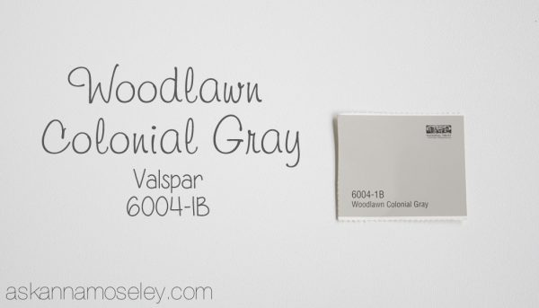
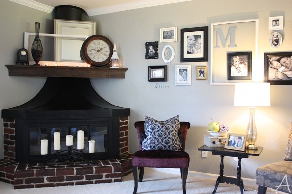
Woodlawn Colonial Gray in our old house Living Room.

Partridge Gray by Better Homes & Garden

Partridge Gray in our new house Living Room.

In this picture the wall on the right is painted with Partridge Gray and the wall on the left is painted with Old Driftwood (info below). Partridge Gray is a Better Home and Garden color but made by Glidden.
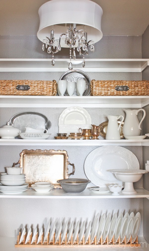
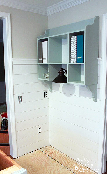
Old Driftwood by Glidden

Old Driftwood in our Pantry.
Why does my gray look purple on the wall?
When picking out gray paint our eyes tend to be drawn to the lighter colors of grays that look gray in the store, but end up looking blue or purple when you paint them on the wall. The trick to finding the perfect gray color is to look for a gray that has a tan base, and maybe even looks slightly tan to the eye.
For example, look at how “tan” the Woodlawn Colonial Gray swatch looks.

But when you get it on the wall it’s a perfect gray color. Here it is on the walls in the living room in our old house.
When I made over the entryway in our old house I painted gray (Sherwin Williams Ponder) above the board and batten. It was a pretty color on the swatch, and in most lighting, but in the evenings it always looked purple and drove me nuts.
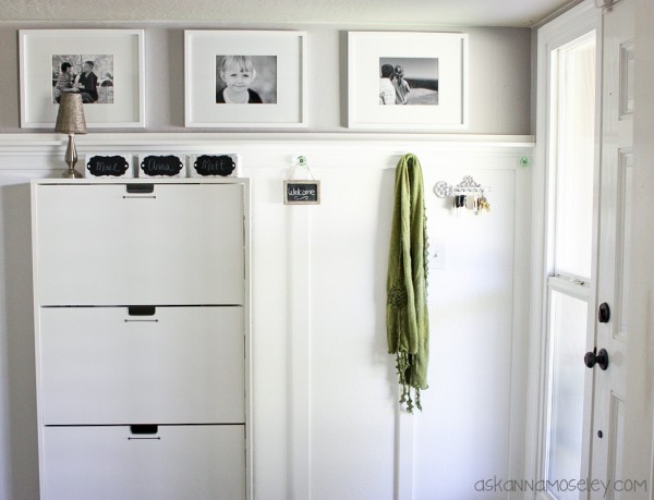
So if you don’t want to end up with purple, or baby blue walls, it’s very important to bite the bullet and purchase a sample.
Buy a Sample
It’s so important when picking out paint, but especially gray paint, to buy a sample of the paint before committing to a whole gallon, or more. Each gray paint color will look different in your house than it does in someone elses house because of lighting, surrounding decor or even other paint colors in the room. So before committing to a large amount of paint, buy a sample. When you get the sample home don’t just paint it in one little spot in the room, paint a 1′ x 1′ square on every wall in the room you are painting. Don’t be scared, use the whole sample, that’s what it’s for!

This is our house right after we had moved in and made any changes.
Paint will look different in different types of lighting and at different times of the day. To get a true idea of how the paint will look when it’s painted in the entire room, it’s very important to see the color on each wall, at different times of the day, and in all types of lighting. Once you have painted the sample on multiple walls, live with it for a few days. I usually wait a week before committing to a color. Seeing the sample in different lighting, at different times of the day, for multiple days, will give you an accurate idea of whether or not you really like it. (This trick goes for all paint colors, not just gray).

I hope these tips help you to be able to find the perfect gray color for your walls! Here are some other great posts to help you pick choose the perfect gray.
How to Pick the Perfect Gray Paint from Love, Pomegranate House

Gray, Grey or Greige from Pretty Handy Girl
Picking the Perfect Gray from The Turquoise Home
Looks great! My favorite gray colour is called s-2000-n. I think it just looks so perfect!
Those are some great tips! One other thing to consider is time of year. I try to wait until all our trees have filled in before choosing colors. The outside foilage turns things green in our house. But, we do have a lot of trees ;-).
Thanks for the link to my post. xxxooo
That’s a great tip Brittany, I didn’t even think about the trees! We have a lot of trees around our house too so I’m sure that makes a difference. 🙂
Anna
that was so helpful,I can’t seem to find out just want I want to do.
We have two greys in our home and love them! But we did go with the samples first to make sure they were what we wanted at different times of day. These are great tips!
What are the colors? I’d love to know of other great grays!
Thankyou for the tip on getting samples just to make sure the color is good in all kinds of light. Painting a narrow hallway upstairs.
I love the Woodlawn Colonial Gray color and want to use it in a bonus/office room. I went to lowes to get it and they no longer have the color in their computer. I’m assuming its discontinued, although I haven’t read anywhere that actually says that it is. Curious if you knew?
I was just there last week and they had it! So weird. The number for the paint is 6004-1B, see if they can look it up that way.
I went back a different day last week and another employee was able to find it on the computer for me! Turns out the color swatch was completely out since its so popular. I painted my bonus room and upstairs bathroom with it. Love it! Thanks for the post.
I went back a different day last week and another employee was able to find it on their computer for me! Turns out the color swatch was completely out since its so popular. I painted my bonus room and upstairs bathroom with it. Love it! Thanks for the post.
Yay, I’m so glad!!!
Hi Anna! My question is why does my paint look kinda chalkyish and flourescenty? I have a bathroom that is very small and has no natural light. I painted the vanity cabinet Spare White from SW and wanted to use Sea Salt on the wall as I did in my living room and hall way. On the wall the sample I painted looks chalky and glowing. Not the pretty light blue/gray like in the rest of the house! Should I just do a darker gray on the same paint swatch like Oyster Bay by SW? I was hoping for a nice Blue/Gray but now not so sure.
If the color isn’t looking the way you want it to, I would go to a different swatch altogether. If you’re looking for more blue, go to a more blue palette. If you’re looking for more grey, look for one that appears more tan on the swatch.
Would the old driftwood look good with dark wood trim?
Yes, I think that would look really good.
I love all your tips! Picking paint colors is so hard! Could you suggest a good dark gray color? I will be painting the top half of our master bath this color. Thanks so much!
The Woodlawn Colonial Gray is a great darker gray color. It’s a really pretty color, probably my favorite gray. 🙂
I’ve been looking for a “true” gray ever since I painted my living room “Gravity” by Valspar and it turned out to have blue undertones. It turned out ok in the end, I just painted an accent wall with a pretty shade of blue but I’m thinking of re-doing to a darker gray blue accent. Any suggestions?
I’m going to go with Woodlawn Colonial in my bedroom. I have a comforter with shades of pinks that I love and one with blue, gray and deep purple that I love as well. I want to do an accent wall in my bedroom too, any suggestions?
Thanks for your help!
Your blog is great!
Hi Christina! I’m not one to typically do an accent wall but if you really want to do one, I would stick with the same color, just one or two shades lighter or darker. Accent walls in a small space can make a space feel too busy or cluttered but if you stick with the same color, just go a little lighter or darker, it would be really pretty. Hope that helps. Oh and you’ll love the Woodlawn Colonial Gray, it’s my favorite!
We have Sherwin Williams Dovetail in out Master Bathroom. Its a gorgeous warm dark gray. I have found it to be the most gorgeous dark gray.
Hi Anna!
Great pointers. Do
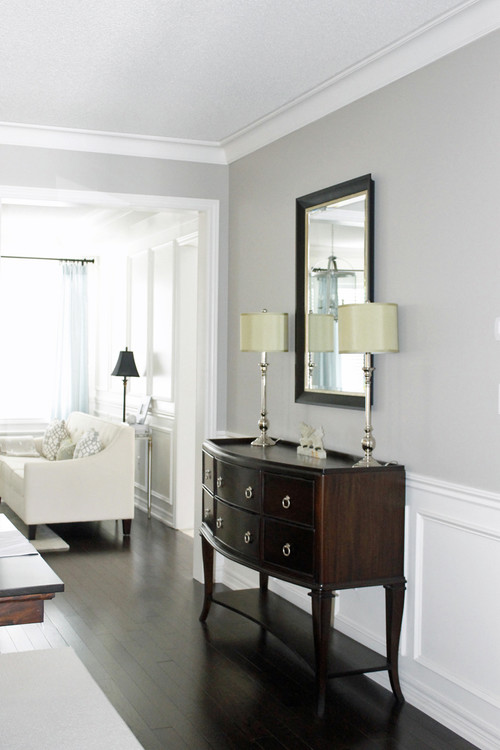
you happen to know which gray paint was used for the last picture in this post? It is the picture with the buffet type table against the wall and two lamps on top of the table. Thanks in advance!
It’s Revere Pewter, HC 172.
So, what is the name of the beautiful gray in that last picture above? I’m looking for a soft, warm gray for the walls in a cute little one bedroom house that my husband and I are going to rent. We’re going to refinished the hardwood and stain them in a dark color, like dark walnut maybe. I want a nice gray for the walls and will paint the trim a bright white. Your tip about looking for a gray with tan undertones is helpful. Thanks!
Hi, Terese! I’m Anna’s Assistant, Bethany. The gray in the last picture is called Revere Pewter by Benjamin Moore Paints. The original source for this was from http://theturquoisehome.com/2013/02/picking-perfect-gray-paint/. Hope this helps and good luck with your painting and staining projects!
Hi Anna, I am trying to redo my home for my daughters wedding !!! I have sw Blonde on the wall now. A friend who is a decorator, suggested I redo the walls in reverse pewter BM But I have honey oak trim and honey oak cabinets and shiney brass gold hardward through out the home. I am scared to go gray. My floor is wood and tiles that are gray and white that looks like marble. What should I do !!!! My furniture is county french. Help with any suggestions you have ty.
Will you email me a picture? I’m a visual person so that would be very helpful. 🙂
Thank you for the “brown” tip. I had tried more than 10 different gray samples and everything looked blue. Tried a few browns and am finally close to the color I want.
Thank you!!!! I spent $40 on a gallon of paint only to have it look blue! I found your article and purchased the Woodland Colonial Gray and it is perfect! I wish I researched and found your advice before! Thank you!!!
Awesome, glad I could help! I love that gray, it’s definitely one of my favorites. 🙂
Hi Anna, I’m hoping you can answer a question for me about gray paint —- I recently painted my kids’ bedroom Dolphin Gray by Glidden. My goal was to go for a very soft, subtle, simple gray. The furniture in the room is creamy white (beds, crib, changing table) and dark brown (bookcase, baskets, dresser, shelving). Bedding is white and light aqua (more blue than green), and I have accents of coral and yellow. The frames on the wall are a mixture of different rusticy woods. The overall feel of the room is very neutral, brown, and white with a hint of aqua. So… When I got the paint on the walls, the gray color looks baby blue instead of a soft gray. I hate the way the wall color looks and I hate the way it changes the aqua bedding to blue also. I plan to change the lighting to a warmer light but I’m not sure I’ll be fully satisfied by this solution. I also don’t want to repaint the whole bedroom, but I am thinking of painting thick horizontal stripes on just one wall. Here’s my question for you: Should I paint the stripes in a creamy white, or a more pale (less blue) gray color, or a tan/greige? Which of these options will tone down the blue in my current paint color?? And which ever color you choose, please help me understand what undertone that color should have. Thanks so much in advance for your help!!
Hy Taryn! I’m so sorry about the “baby blue” color, I’ve totally had that happen to me before, which is why I wrote this post. To be honest, the only way you’re going to be able to fully get rid of it is to repaint. 🙁 I know that’s not what you want to hear but trust me, it will be worth it in the end. My favorite go to gray is Woodlawn Colonial Gray, which definitely has tan undertones, but if you want one a little lighter Partridge Gray is also a really good color. My entire living room is currently Partridge gray and even with all the teals and blues I have in the room, it is still very gray.
If you are absolutely not wanting to repaint, and just go with the stripe idea, I would recommend Valspar’s Cool Gray, which is essentially white but with a light gray undertone, which should help balance out the “blue gray”. I hope this help! Let me know what you end up doing, or if you have any other questions. 🙂
Hi Anna,
I actually want a grey with purple undertones, not to dark but subtle. I don’t even know where to begin with the color charts? Should I go with the greys or the purples? I am using Valspar 2000 as I already purchased a color and it is way to lavender and Valspar will replace at no cost! Thanks for any tips!!
I painted our old entryway with a gray that had slightly purple undertones to it and it was beautiful (https://askannamoseley.com/2012/10/board-and-batten-entryway-makeover/). It’s by Sherwin Williams and it’s called Ponder. If you go to Lowe’s they can look it up in their system and mix it for you.
I found that BEHR Premium Plus Ultra #PWN-72 Baked Biscotti was the perfect gray for my space.
: )
That is a great shade!
Hi Anna,
I have a kitchen just painted in light grey. I’ve waited a week and no matter what time of day of week it looks a baby blue.
I have one main wall (accent wall) I painted with Behr called Campfire (HDC-AC-06) from Home Depot.
I know I’ll end of repainting over the grey that looks baby blue.
Please provided me the best grey color for my kitchen with the scenario I am faced with. What product code of Light Grey should I use from Home Depot or even Lowes?
Home Depot has an online color swatch stating Keystone Gray HDC-AC-21 or Garden Promenade HDC-AC-18. The Keystone Grey looks just a little lighter than the Garden Promenade.
Here’s the online website I’m referring to. http://www.behr.com/consumer/ColorDetailView/HDC-AC-06
I don’t want it to look baby blue again. I didn’t use a Behr grey product and I’m sure that was my fault for letting the paint rep at Home Dept refer me to another grey by a different co. I want to repaint it with a good light grey that with work my accent all.
I’ve read a little about tan under tones is this what I need?
I cannot for the life of me find the perfect gray. I have at least 2 dozen samples of various shades, but none of them are what I’m searching for. In the past few months, I’ve painted my bedroom 3 times! Spent $50 on the first shade and it turned out almost periwinkle! Primed and painted a different shade and it still looks purple. Right now there are swatches painted all over the walls. I’m heading out to Lowe’s to try the Woodlawn Colonial Gray. Wish me luck!
I would love to know what you think of it, it’s one of my favorite gray colors. 🙂
The best way to get the color your after from any paint chip, especially something like grey is to prime the walls well first, use a sealer blocker like KIlls just to be sure IMO. If you Prime correctly and use a high quality paint you’ll only do 2 coats , the primer and the finish.
Oh and the color grey that finally worked was a Sherwin Williams called Knitting needles , you can get it at lowes but you’ll have to ask at the desk, they don’t have the chip, at least they did not have it here in Denver, found the color at the uber expensive Sherwin Williams store.
@anna the color of https://askannamoseley.com/2012/10/board-and-batten-entryway-makeover/
is spectacular I made note of that, thank you so much.
I’m glad you like it!
After wasting so much time searching for a neutral grey, Woodlawn Colonial Gray was exactly what I was looking for. Thanks for sharing. Now I need to find something 2-3 shades darker for trim 🙂
Awesome!!! That is one of my favorites. 🙂
I’m wondering what you think of the shade Portland by Valspar. I painted it in my son’s bedroom and loved it; now painted my whole family room in same and it is not saturated enough. I’m think about repainting. Thanks.
I’m not familiar with the color but I do know that the same color can look different in different rooms because of the colors reflecting around it. If you like the color, you think it’s just a little too light, then another coat would probably be the answer.
Thank you so much for these tips!! I’m in the process of changing all of my rooms over from brownish earth tones to soothing grays. When I bought my townhouse, it had green carpet (1989, anyone??). So, I used the earth tones to compliment. Now that I’ve installed brownish tile throughout, there is too much brown.
My main living room is Valspar Cathedral Stone, which is a color I absolutely love. I use Valspar Signature religiously. I went to paint my kitchen, and just like you said, the Valspar Gravity color looked like a perfect soothing gray in Lowe’s only to have a light blue tint on the wall. I tried to make myself like it or convince myself it was gray, but I couldn’t get past it. So, I went with Valspar Tempered Gray for the kitchen, and it came out exactly like I wanted. I’ve used the Tempered Gray on my hallway, as well.
So, next is to do my master bedroom and home office. I’m leaning towards the Valspar Woodlawn Colonial Gray for the bedroom (thanks to your page!), and for my home office, I’m looking at the Valspar Homestead Resort Jefferson White (wall here:theshakerhouse.files.wordpress.com/2014/01/dsc_0018.jpg) which appears like a very light gray and could really brighten up a home office.
Thanks again for your tips!
What color “true” gray would you recommend using in my study? Lots of natural light. I want to avoid anything with a blue undertone. We have brown leather chairs and a yellow and gray rug. I would prefer valspar because I’ve already purchased a gray that looks blue that I’m returning due to being unsatisfied. Thanks so much!
The Woodlawn Colonial Gray is my all time favorite and will NOT look blue or purple! 🙂
I am going to put Classico Blanco porcelain tile from Home Depot in my bathroom. I now need to pick out paint. I am not color blind, but have difficulty seeing colors as most people do. I have painted 3 different samples (Valspar’s Filtered Shade, Valspar’s Moon Shot and Benjamin Moore’s Cascade White) on the wall and none seem to be working. The Moon Shot matches best, but is darker than I would like. I know it’s a long shot that you can help me as you probably don’t just happen to have the tile at your disposal! But I’m asking if you have any suggestions anyway! I so appreciate anyone who has an eye for this type of thing.
I could probably help you better if you send me a well lit picture. You can email me at askannamoseley @ hotmail (dot) com.
So glad I found your Tips! I have not been a fan of gray because of the blue undertone in them it seemed. My teenager wants his bedroom painted gray to go with changes in furniture and accents of black and orange. I had no idea on how to go about picking one that honestly I could live with. I brought home a sample to throw up on the wall and was a little concerned when it looked more tan or beige than gray, but your tip of look for one that appears tan gives me hope that I’m on the right track. Thanks for sharing!
You are SO welcome!!! 🙂
Hi Anne.. thank you so much for your article.. im painting a deck and a pagola and I used Shale Grey and it looks baby blue.. i have a long and narrow back yard and have no idea.. are you able to help ?? ?
The funny thing about gray is it can look different shades depending on what’s reflecting off of it. My go to best gray color is Woodlawn Colonial Gray from Lowes, it looks gray every time. 🙂
I purchased gravity by Valspar and I just knew it would be amazing. Every single place I’ve seen it, it looks grey. But on our walls it looks blue. It’s not terrible but I want grey! That’s going to Be the color for the whole house(entryway, kitchen, sitting area). Help! Are you familiar with Gravity?
No, I’m not. Pictures are deceptive though because of editing. My go to is always the Woodlawn Colonial Gray or the Partridge Gray so I’d try one of those. 🙂
What are some light grays for kitchen walls. my cabinets are white and countertops are pine wood. How does rocky bluffs compares to your all time favorite, Woodland Colonial Gray?
I’m not familiar with Rocky Bluffs, but from a Google search, it looks like it’s pretty similar to Woodlawn Colonial Gray. I think for a kitchen though it would be good to go with a gray that’s a little lighter, something like Old Driftwood that I used in the pantry at our other house. 🙂 I’d love to know what you end up choosing!